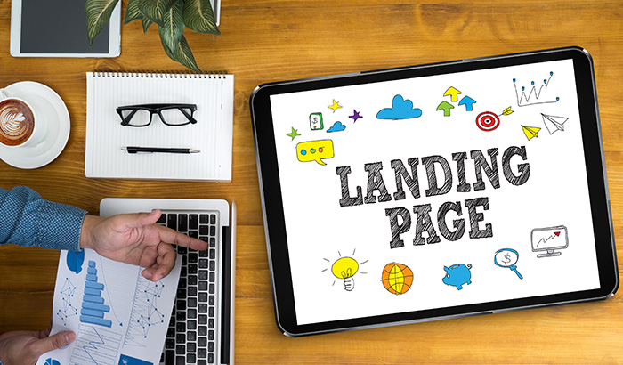
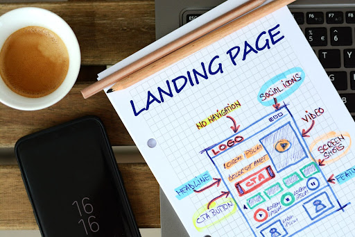
Landing pages are the essential unsung heroes in successful online campaigns. These specialized web pages are crafted to achieve a crucial goal: converting visitors into leads or customers. Landing pages are ideal for launching new products, driving sign-ups, or promoting special offers, which are key to turning marketing strategies into tangible results.
A landing page’s effectiveness hinges on its focus and clarity. Unlike a homepage offering a broad overview, a landing page hones in on a specific offer or message. It’s meant to forge a connection with visitors by delivering exactly what the ad or link promised.
Effective landing pages excel in several areas. They capture attention with headlines that resonate with visitors’ interests or needs. The content is concise and compelling, delivering a resonant message efficiently. Visuals enhance and support the statement, guiding visitors toward the desired action. The call to action is clear and prominent, leading visitors to take the next step, be it a purchase, webinar registration, or guide download.
In essence, a landing page transforms potential customer interest into concrete action. It’s a perfect blend of creative and strategic elements, and when executed well, it significantly boosts campaign success by turning visitors into valuable conversions.
Understanding Your Audience
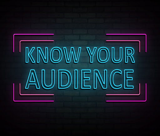
Having a deep understanding of your target audience is paramount when it comes to effective digital marketing. This knowledge is the foundation upon which successful landing pages are built.
Knowing your audience goes beyond mere demographics; it’s about grasping their motivations, challenges, preferences, and behaviors. This insight shapes what you communicate and how you communicate it.
The significance of audience understanding must be balanced. It guides the tone and language of your content, ensuring it resonates with the intended users.
For instance, a landing page targeting young tech enthusiasts will have a different vibe and language than one aimed at professionals seeking financial services. Audience knowledge also influences the choice of visuals, layout, and color scheme, aligning these elements with what appeals to your specific audience.
This tailored approach extends to how you structure your message. Understanding your audience’s pain points and desires allows you to craft content that speaks directly to their needs. It helps in highlighting the benefits of your product or service in a way that is meaningful to them.
If your audience values time-saving solutions, your landing page should emphasize how your offering will save them time.
Moreover, audience insight informs the design of your call to action. It helps determine the right placement, wording, and design that will most likely engage your audience. A CTA that resonates with your audience’s expectations and desires is more likely to result in conversions.
Understanding your audience influences every aspect, from content and design to the overall user experience. By aligning your landing page with the needs and preferences of your audience, you set the stage for higher engagement and conversion rates.
Crafting a Compelling Headline
A headline is often the first element that catches a visitor’s eye on a landing page. Its role is pivotal in making a strong first impression and can determine whether a visitor stays to learn more or leaves the page. Crafting a headline that grabs attention is an art that combines creativity with a deep understanding of what drives your audience.
One key tip for writing effective headlines is to make them benefit-focused. Instead of merely stating the product or service, a great headline should convey what it can do for the user.
For instance, a headline like “Transform Your Nights with Our Advanced Sleep Solutions” is more engaging than just saying “Buy Our Sleep Products.” It directly addresses a common problem (poor sleep) and suggests a tangible benefit.
Another strategy is to evoke curiosity or emotion. Headlines that pique interest or touch on emotional aspects are more compelling. For example, “Discover the Secret to Lasting Youth” can be more enticing than a straightforward headline like “Anti-Aging Products for Sale.” It creates intrigue and a desire to explore what the secret might be.
Using clear and concise language is also crucial. The most effective headlines are usually short and to the point. They deliver the message quickly and efficiently, making it easy for visitors to grasp the value proposition instantly.
For example, “Get Fit in 5 Minutes a Day” is a headline that’s both straightforward and appealing, promising a significant benefit (getting fit) with minimal time investment.
Incorporating numbers or statistics also adds credibility and specificity to a headline. A headline like “Join 10,000+ Happy Customers in Achieving Financial Freedom” gives a sense of reliability and success, which can be very persuasive.
Effective headlines connect quickly with the audience, offering them a reason to explore further and engage with the content on the landing page.
Clear and Concise Messaging

A landing page only has a few seconds to grab and retain a visitor’s attention. The content needs to communicate your message effectively without overwhelming the reader. Clear and concise messaging helps visitors quickly understand what you offer and how it benefits them, making them more likely to engage further.
The role of clear messaging is to cut through the noise and focus on what matters most to your audience. This involves highlighting the key benefits of your product or service straightforwardly.
For example, use simple language that addresses the visitor’s needs or problems instead of using complex jargon. A phrase like “Streamline Your Workflow with Our Easy-to-Use Tool” is clear and immediately tells the visitor what the product does and its primary benefit.
To achieve conciseness without losing impact, identify the core message you want to convey. What is the one thing you want your visitors to remember or act upon? Once identified, build your content around this central message, eliminating unnecessary details or filler.
This approach ensures that every word on your landing page serves a purpose and contributes to your overall objective.
Another technique is to use bullet points or short, punchy sentences to break down complex information. This makes the content more digestible and helps guide the reader’s attention to the most important aspects.
Instead of a lengthy paragraph about the features of a product, a bulleted list concisely presents each feature while making the information easy to scan.
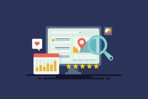
Using High-Quality Visuals
Visuals are an indispensable part of any effective landing page, playing a significant role in engaging and captivating your audience. When a visitor lands on your page, the visuals often speak first, setting the tone and inviting them to explore further. The right imagery or graphics can instantly grab attention, create an emotional pull, and help communicate complex ideas more simply and effectively.
We are wired to process visual information swiftly, making images and graphics a powerful tool for immediate communication. For example, a striking, relevant image can make a visitor pause and take notice, increasing their time on your page and enhancing the likelihood of them taking action.
Choosing the right visuals for your landing page requires balancing aesthetics and relevance. The images or videos you select should align with your brand’s message and appeal directly to your target audience.
If you’re marketing a product, high-quality photos showcasing the product in use will help visitors visualize its benefits. The key is clarity and professionalism in your visuals to ensure they enhance, rather than detract from, your message.
Strategically placing your visuals is as important as selecting them. Position images or graphics near key pieces of content or calls to action to guide the visitor’s journey and focus their attention where it’s most needed. Use visuals as signposts, leading the visitor naturally through the information to the desired action.
Remember also to optimize your visuals for online viewing. Ensure images are high resolution yet compressed for quick loading, as slow-loading images might deter visitors. Also, embracing diversity in your visuals can resonate with a broader audience, making your landing page more inclusive and relatable.
Creating a Strong Call to Action
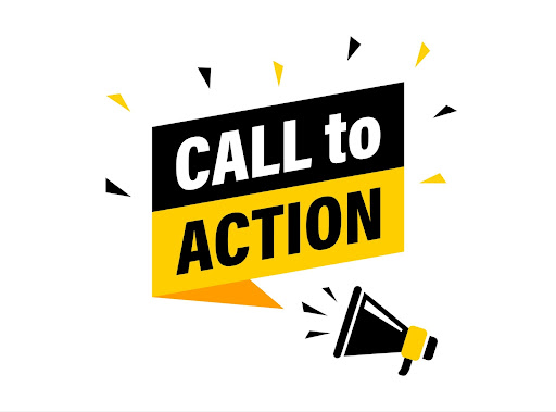
The call to action on your landing page is the critical point where a decision turns into action. It’s what nudges the visitor to take that final step, whether it’s to buy, sign up, or download something. Crafting a CTA that effectively motivates action is both an art and a science.
Firstly, your CTA needs to be crystal clear. It should leave no doubt about what will happen when a visitor clicks that button. Use direct, action-oriented language. For example, “Claim Your Free Trial” or “Download the Guide Instantly” explicitly indicate what the user should expect.
The visual appeal of your CTA also can’t be overlooked. It should be eye-catching and clearly distinguishable from the rest of the page, yet match the overall design. Using contrasting colors is an excellent strategy to make it stand out, but remember to stay true to your brand’s color scheme.
Where you place your CTA is just as important as how it looks. It should be prominently displayed and easy to find without excessive scrolling. For longer pages, consider having it at several key points to catch the visitor’s attention as they navigate through the content.
Let’s consider some industry-specific CTA examples. In e-commerce, a CTA like “Buy Now to Enjoy Exclusive Discounts” is compelling and offers immediate value. For a software company, “Start Your Free Trial Today” invites users to experience the product with no initial commitment. For services like consulting, “Book Your Free Session Now” provides a risk-free way to engage potential clients.
Your call to action should be a beacon on your landing page, guiding visitors clearly toward the action you want them to take.
Optimizing for Mobile Devices
Smartphones are almost an extension of ourselves, so having a mobile-optimized landing page is crucial. Make sure anyone who clicks on your link from a mobile device has a smooth and enjoyable experience.
The key to mobile optimization is a responsive design. This ensures your landing page looks great and functions well, regardless of screen size. Whether someone uses a tiny phone or a large tablet, your content should adjust to fit their screen perfectly. This involves using flexible layouts and images that resize themselves to fit different screens.
Speed is also essential for mobile users. They expect quick access to information, especially when they’re on the move. To keep your page loading quickly, optimize your images, streamline the elements on your page, and consider the overall weight of your page’s code.
Tools like Google’s PageSpeed Insights will give you a clear picture of your page’s speed and offer tips for enhancement.
For the mobile user interface, think simplicity and clarity. Buttons should be large enough to be easily tapped with a finger, and form fields should be straightforward to fill out on a smaller screen. Ensure your page avoids horizontal scrolling, which can be awkward on mobile devices. Stick to a vertical scroll for a better user experience.
Lastly, the text on your page should be easy to read on a small screen. Opt for larger font sizes and break up text into smaller paragraphs. This makes your content more digestible and more appealing to the mobile audience.
Optimizing your landing page for mobile ensures that anyone, anywhere, on any device, has a great experience interacting with your page. You’re setting your page up for success in the increasingly mobile-centric online world.
Including Social Proof and Testimonials
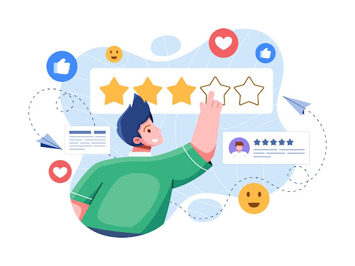
In the form of customer testimonials, ratings, and endorsements, social proof acts as a powerful endorsement of your product or service, providing potential customers with the confidence they need to make a decision.
The real power of social proof and testimonials lies in their ability to personalize and add credibility to your offering. Beyond the basic selling points, social proof creates an emotional connection, showing real-life examples of satisfied customers. This authenticity resonates with visitors, making them feel more secure about their potential choice.
When adding testimonials to your landing page, prioritize genuine and relatable ones. A testimonial that speaks directly to how your product solved a problem or improved someone’s life is incredibly persuasive. Integrate these testimonials naturally into your page design. Ideally, a customer’s name and photo should go with the review to add a human touch.
In addition to individual testimonials, showcasing any awards, certifications, or media features will further bolster your credibility. A badge from a recognized authority or a quote from a popular publication can instantly elevate your landing page’s trust factor.
For B2B landing pages, detailed case studies are particularly effective, providing a comprehensive look at how your product or service has delivered results.
Simplifying the Form-Filling Process
When it comes to converting visitors on your landing page, the design of your form can make all the difference. A form that’s too long or complicated is a major hurdle, potentially turning away potential leads. The key is to make the form-filling process as straightforward and hassle-free as possible while still gathering the essential information you need.
Start by asking only what’s necessary. Every additional field in your form can be a potential drop-off point, so it’s important to limit your questions to the bare essentials.
For instance, if you’re looking to gather email subscribers, just an email usually does the trick. Overloading the form with unnecessary fields can overwhelm users and discourage them from completing it.
The layout of the form is another critical factor. It should be clearly organized and easy to understand at a glance. Ensure each field is properly labeled, and there’s enough spacing between fields to avoid confusion. If your form is longer, consider breaking it into smaller, more digestible sections. This can make the process seem less intimidating and more user-friendly.
Incorporating autofill options will streamline the experience. Allowing users’ devices to auto-populate known information like names and addresses saves time and effort. Moreover, if there’s an error in the form, make sure your error messages are clear and helpful. Point out exactly where the mistake is and suggest how to correct it.
The balance between getting the information you need and making the process convenient for the user is crucial. While detailed information might be valuable for your marketing strategy, asking for too much can deter users from completing the form. An effective approach is to make some fields optional, allowing users to provide additional information if they wish.
A well-designed form is simple, clear, and considerate of the user’s time and effort. By focusing on these aspects, you can make the form-filling process a seamless step in the visitor’s journey, ultimately leading to higher conversion rates.
Testing and Continuous Improvement
In the dynamic landscape of digital marketing, the concept of “set it and forget it” doesn’t apply, especially when it comes to landing pages. A/B testing becomes an essential practice. It’s a strategy that lets you compare two versions of your landing page (A and B) and see which one resonates more with your audience, essentially letting them guide your design choices.
A/B testing allows you to try out both options in real-time, with actual visitors, and make decisions based on concrete results. You change one element at a time — maybe the CTA button’s color or your headline’s phrasing — and measure how each variation performs. This method helps you pinpoint exactly what works best.
Alongside A/B testing, it’s vital to embrace a culture of ongoing improvement informed by user feedback and analytics. Listening to what users have to say about your landing page can provide invaluable insights. Maybe they find a form too long or love how clearly you explain your product.
Combining these insights with hard data from analytics gives you a well-rounded view of where your landing page stands and what can be improved. If you notice a lot of visitors drop off at a certain point, it might be an area to investigate and tweak.
Think of your landing page as a living, breathing entity that needs to evolve. Regularly reviewing feedback, analyzing performance data, and making adjustments based on what you learn keeps your page fresh and compelling. This approach ensures your landing page stays aligned with user needs and expectations, continually driving better results.
Continuous testing and improvement are the keys to keeping your landing page at peak performance. By embracing a proactive, data-driven approach to tweaks and changes, you ensure your landing page remains a powerful tool in your digital marketing arsenal.
Revity Can Help Your Business Transform Your Landing Pages and More!
Perfecting these elements of effective landing pages while managing your business’s day-to-day operations can be quite a challenge. At Revity, we don’t merely build landing pages; we craft powerful conversion tools tailored to your audience, ensuring they resonate and engage.
Revity Marketing Agency’s team of digital marketing experts specializes in creating landing pages that capture attention and drive conversions. We understand that every business is unique, so we tailor our approach to your specific needs and goals.
With Revity, you have a partner who understands the ins and outs of digital marketing. We’re here to take the load off your shoulders, bringing our expertise and creativity to ensure your landing pages are not just good, but great. Contact Revity Marketing Agency to elevate your landing pages and boost your conversion rates!