

It’s crucial to understand the importance of mobile optimization for your eCommerce site and its significant impact on driving success in today’s age.
Gone are the days when users relied solely on desktop computers for online shopping. The rapid growth of smartphones and tablets has transformed how people browse, research, and purchase products or services. Mobile commerce has skyrocketed, with a substantial portion of online transactions occurring on mobile devices.
In this blog, we’ll delve into the essential tips and techniques to help you optimize your eCommerce site for mobile users. From ensuring lightning-fast page load speeds to designing responsive interfaces and streamlining your content, we’ll cover a range of actionable strategies to enhance your mobile presence.
Let’s dive in and unlock the secrets to driving success in the ever-evolving mobile landscape!
Why Should I Optimize for Mobile?
With the proliferation of mobile devices and the ever-increasing number of users relying on them for their online activities, optimizing your eCommerce site for mobile is no longer an option – it’s a necessity. Ignoring the mobile user experience can have detrimental consequences for your business. Here are a few reasons why you should prioritize mobile eCommerce optimization:
- Mobile Is the Present and Future: Whether browsing social media, searching for information, or making purchases, users are reaching for their smartphones and tablets more than their laptops and desktop computers. By optimizing your eCommerce site for mobile, you position your business to thrive in the digital landscape.
- Enhanced User Experience: Mobile eCommerce optimization is about providing a seamless and enjoyable experience for your mobile users. It’s about understanding their needs, preferences, and behaviors and tailoring your site accordingly.
- Search Engine Optimization (SEO) Benefits: Mobile optimization goes hand in hand with SEO. Search engines like Google prioritize a mobile-friendly website over one that isn’t optimized for mobile in their rankings, as they understand the significance of delivering a positive mobile experience to users. By optimizing your eCommerce site for mobile, you increase your chances of appearing higher in search results.
- Increased Conversion Rates: User experience plays a significant role in driving conversions. When your eCommerce site is optimized for mobile, you remove barriers that can hinder the purchasing process. Mobile users who encounter a smooth and frictionless experience are more likely to complete transactions.
- Competitive Advantage: In a fiercely competitive eCommerce landscape, standing out from the crowd is crucial. Optimizing your site for mobile gives you a competitive edge. Many businesses overlook mobile eCommerce optimization, so by staying ahead of the curve, you position yourself as a leader in your industry.
A mobile-friendly website can foster trust and loyalty, giving you an advantage over competitors who still need to prioritize mobile optimization.
Now that you know why you should optimize your mobile eCommerce site, let’s take a closer look at how you can optimize your site for success.
1. Ensure Your Site Loads Quickly
In today’s fast-paced digital world, where every second counts, the loading speed of your eCommerce site plays a crucial role in capturing and retaining the attention of mobile users. Slow-loading websites can lead to frustration and abandonment, resulting in missed opportunities for engagement and conversions.
Before you do anything, you’ll want to test your site speed to see how fast it loads on mobile. This will give you an idea of the amount of optimization you’ll need to do regarding speed.
To ensure a seamless and speedy user experience, consider implementing the following optimization techniques:
- Leverage browser caching to store static resources on users’ devices and reduce the need for repeated downloads.
- Implement lazy loading techniques to load images and videos only when they become visible to users.
- Minimize the number of redirects on your site to reduce round trips to the server.
- Regularly monitor and audit your site’s performance.
Those are just a few things you can do to speed up your mobile site. By following these optimization strategies and implementing more, you can ensure that your eCommerce site loads quickly, providing mobile users a smooth and enjoyable browsing experience.
2. Use Responsive Design
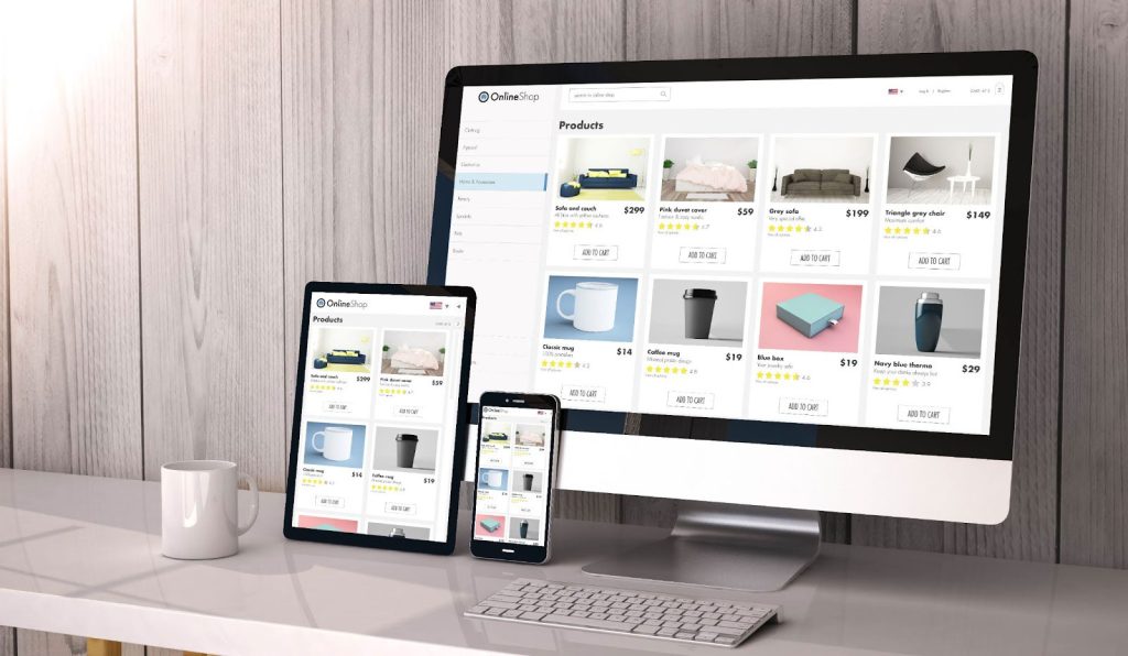
Responsive design is an approach to eCommerce site design that aims to create websites that adapt and respond to different screen sizes and devices. It involves building a flexible and fluid layout that adjusts its elements, images, and content based on the screen resolution and device capabilities.
Responsive eCommerce site design ensures that your eCommerce site provides an optimal user experience across a wide range of devices, from desktop computers to smartphones and tablets.
Regularly test your site’s responsiveness across various devices and screen sizes. Use testing tools to identify and fix any layout, navigation, or content presentation issues. Also, gather feedback from real users to understand their experience and make necessary improvements.
3. Optimize Images and Videos
Images and videos play a crucial role in enhancing your eCommerce site’s visual appeal and engagement. However, large media files can significantly impact loading times, especially on mobile devices with limited bandwidth and slower connections.
Optimizing your images and videos ensures they maintain quality while minimizing file sizes, resulting in faster loading speeds and a smoother user experience. Here are some essential tips for optimizing images and videos on your eCommerce site:
- Compress Images: Before uploading images to your site, use image compression techniques to reduce their file size without compromising visual quality. You can use online image compression tools or editing software to achieve optimal compression levels.
- Use Image Formats Wisely: Different image formats have varying compression levels and suitability for different types of images. JPEG is commonly used for photographs and complex images, as it balances quality and compression.
PNG format is ideal for images with transparency or simple graphics. Consider using modern image formats like WebP, which provide superior compression and smaller file sizes.
- Lazy Load Images: As we mentioned above, lazy loading can help speed up the loading process; implementing lazy loading with your images is crucial if you have larger images.
Implement lazy loading techniques to load images only when they are about to enter the user’s viewport. This technique prioritizes the initial content of the page, reducing the initial load time. As the user scrolls, images below the fold are loaded dynamically, enhancing your site’s overall performance.
- Optimize Video Files: Videos can significantly impact loading times due to their large file sizes. To optimize videos, use video encoding techniques that balance file size and quality. Compress videos using codecs like H.264, and consider offering multiple video resolutions or streaming options to cater to different devices and connection speeds.
Reduced file sizes lead to faster loading times, enabling users to view and interact with your content without delay. Implement image compression, resizing, appropriate file formats, and video optimization techniques to ensure a seamless multimedia experience for your mobile users.
4. Use Pop-Ups Sparingly
Pop-ups can effectively capture user attention and drive conversions on your eCommerce site. However, excessive or poorly designed pop-ups can be intrusive and disrupt the user experience, particularly on mobile devices with smaller screens.
To maintain a positive user experience while leveraging the benefits of pop-ups, it’s important to use them sparingly and thoughtfully. Here are some considerations and tips for using pop-ups effectively:
- Define Clear Goals: Before implementing a pop-up, define its purpose and how it aligns with your business goals. Whether you’re aiming to grow your email list, promote a limited-time offer, or provide relevant information, a clear goal will help you design a targeted and effective pop-up strategy.
- Timing and Frequency: Timing is crucial when it comes to pop-ups. Ensure that pop-ups appear at appropriate moments, such as after a user has spent a certain amount of time on your site or when they are about to exit a page. Avoid overwhelming users with frequent pop-ups, leading to annoyance and increased bounce rates.
- Provide Value and Relevance: Make sure your pop-ups offer value to users. Provide compelling offers, exclusive discounts, or valuable content that aligns with their interests and needs. Relevant and personalized pop-ups are more likely to engage users and drive conversions.
- Mobile-Friendly Design: Design your pop-ups with mobile devices in mind. Opt for a responsive eCommerce site design that adapts to smaller screens.
- Provide Easy Exit Options: Make it effortless for users to dismiss pop-ups if they’re not interested. Clear and prominent close buttons or easy-to-find “X” icons allow users to exit the pop-up quickly without frustration.
Using pop-ups sparingly and thoughtfully can engage users effectively without compromising their browsing experience.
5. Streamline Your Content
Mobile users often have limited screen space and shorter attention spans, making it crucial to present your content in a concise and easily digestible manner. By streamlining your content, you can deliver your message effectively while keeping users engaged and informed.
As you craft or adjust the content on your site, identify the most important information you want to convey and prioritize it. Trim unnecessary details and keep the focus on what truly matters. By doing so, users can quickly grasp the key points without feeling overwhelmed.
Also, make sure your content is easily readable on mobile devices. Use a legible font size and consider a responsive typography approach that adapts to different screen sizes. Provide ample spacing between lines and paragraphs to enhance readability and prevent visual clutter.
Clear and concise messaging and well-organized and visually appealing content enable users to quickly grasp your message and take desired actions.
6. Make Sure Your Emails Are Also Optimized for Mobile
Email marketing is a powerful tool for engaging your audience and driving conversions. However, with a significant portion of email opens happening on mobile devices, ensuring that your emails are optimized for mobile viewing is crucial.
By optimizing your emails for mobile, you can deliver a seamless and engaging experience that captures your recipient’s attention, getting them to your eCommerce site and making purchases.
Most of what applies to mobile website optimization also applies to mobile email optimization. Here are a few tips:
- Optimize photos and graphics in email by resizing them to fit mobile screens and compressing their file sizes for faster loading.
- Have a clear call-to-action (CTA) that is prominently displayed and easy to tap on mobile devices.
- Keep your subject line shorter to ensure it is fully visible on mobile screens and entice recipients to open your email.
- Make your email user-friendly by using scannable content, mobile-friendly fonts and colors, and ensuring it is easy to navigate and interact with on mobile devices.
7. The Checkout Process Should Be Easy
The checkout process is a critical stage in the customer journey, and ensuring its ease and simplicity is vital for mobile users. Mobile shoppers often seek convenience and efficiency, so optimizing your mobile site’s checkout process can significantly impact your conversion rates. As you look to simplify the checkout process, here are some things you can do:
- Streamline the Steps: Minimize the number of steps required to complete the checkout process. Mobile users appreciate a streamlined experience, so eliminate any unnecessary fields or complicated procedures that might deter them from finalizing their purchase. Aim to make the checkout process as straightforward and efficient as possible.
- Optimize Payment Options: Offer a variety of popular and trusted payment options that are mobile-friendly. Mobile users may have their preferred payment methods, so providing multiple options, such as credit cards, digital wallets, or mobile payment apps, enhances convenience and encourages them to complete the checkout process.
- Display Progress Indicators: Show clear progress indicators during checkout to inform users about their current stage. This helps manage expectations and gives users a sense of control. Progress indicators also serve as a visual cue for the simplicity and efficiency of your checkout process.
8. Make Navigation Easy
Creating an effortless navigation experience on your mobile eCommerce site is crucial for enhancing user satisfaction and facilitating product discovery. To achieve this, focus on implementing a clear and consistent menu structure, ensuring that it is easily accessible from any page.
By organizing categories logically and using descriptive labels, users can intuitively navigate your site and locate the products or sections they are interested in. Additionally, incorporating a prominent search bar allows users to perform quick keyword searches and retrieve relevant results, enabling efficient product discovery.
As you prioritize these elements, you can optimize the navigation experience for mobile users, ultimately increasing engagement and conversion rates.
Take Your eCommerce Site to the Next Level With Revity
Are you ready to revamp your mobile eCommerce site and unlock its full potential? Look no further than Revity! Our team of experts is here to help you optimize your site for mobile users and drive exceptional results.
With our cutting-edge strategies and in-depth knowledge of eCommerce and optimization, we can propel your online business to new heights. Don’t let your mobile site fall behind the competition; it’s time to take action!
Whether you’re just starting with mobile eCommerce or looking to enhance your existing mobile presence, Revity has you covered. Our tailored solutions are designed to create a mobile-friendly website, ensuring seamless user experiences and increased conversions.
Contact us today using our online form or at 801-877-0608 to learn how we can optimize your site for mobile users and desktop users alike and help you achieve your business goals.


